House Dancers: a dance school and a merch shop, one website
End-to-end UX, UI design and build for a house dance school that needed to serve two distinct purposes at once: helping visitors find and book classes, and selling branded merchandise. (Site is in Ukrainian. The client's audience is Ukrainian-speaking.)
The challenge
The client ran a house and hip-hop dance school and wanted a website that did two distinct things: attract new students with class information and schedules, and sell branded merchandise to the existing dance community. These are not the same user goal, and combining them in a single site without confusing visitors was the central design problem.
The core navigation challenge: a visitor who arrives looking for class times should find them immediately, without the shop pulling them off course. And someone browsing merch shouldn't have to wade through schedules to find what they want. Two journeys, one front door.
The school also had strong visual content (performance photos, dance battles, teacher profiles) which needed to be showcased without turning the site into a media gallery at the expense of the practical information people came for.
My role
Responsibilities
- Defining site structure and content hierarchy
- Planning user flows for class discovery and merch browsing
- UI design for all key screens, desktop and mobile
- Visual style direction: palette, typography, layout
- Building and launching the site using Tilda
- Responsive implementation across devices
Tools
- Figma: design and prototyping
- Tilda: no-code build with custom modifications
- Google Analytics: post-launch traffic tracking
Information architecture
Separating two journeys before touching the UI
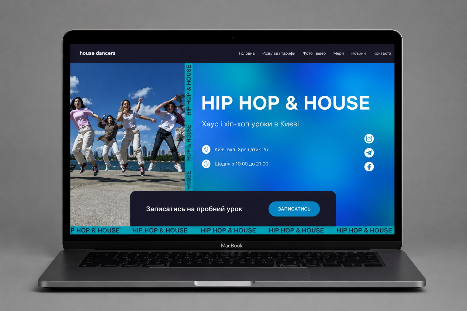
Before designing a single screen, I mapped the full site structure. The dual-purpose nature of the site meant getting the information architecture right was more important than usual: the navigation had to make both paths immediately legible from the homepage.
- Hero + CTA
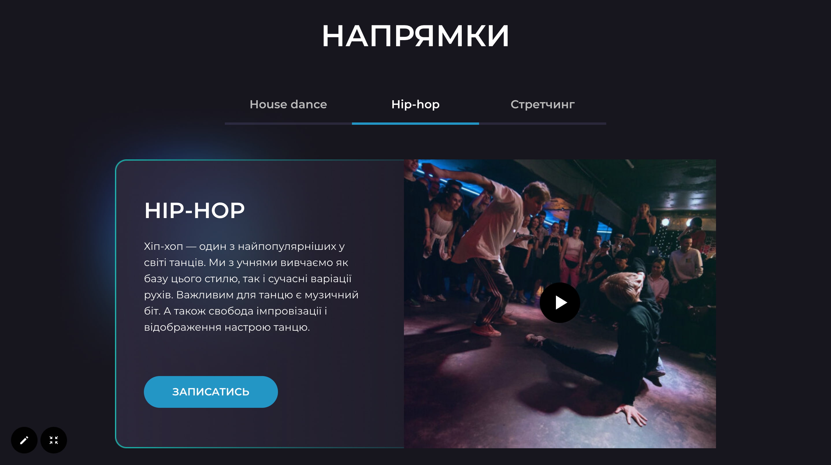
- Dance styles
- Photo and videoLinks to gallery page
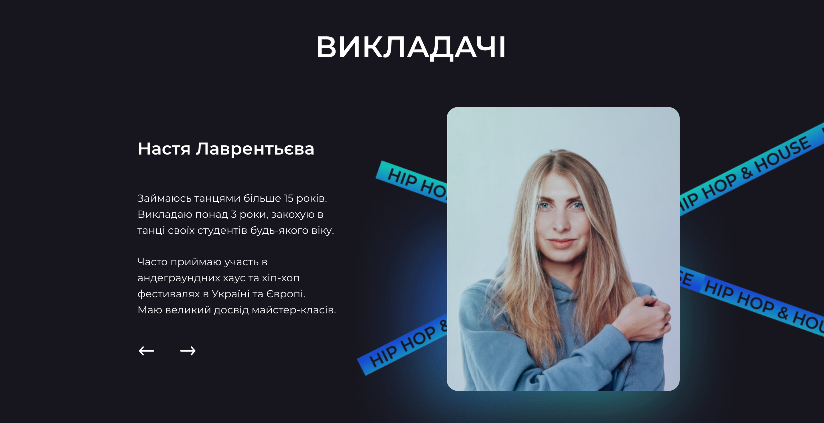
- Teachers
- Merch preview
- Instagram feed
- Class timetableSignup pop-up on click
- Pricing tiers
- Video gallery
- Photo gallery
- CTA
- "House is love" screen
- Product catalogueFilters + individual product cards
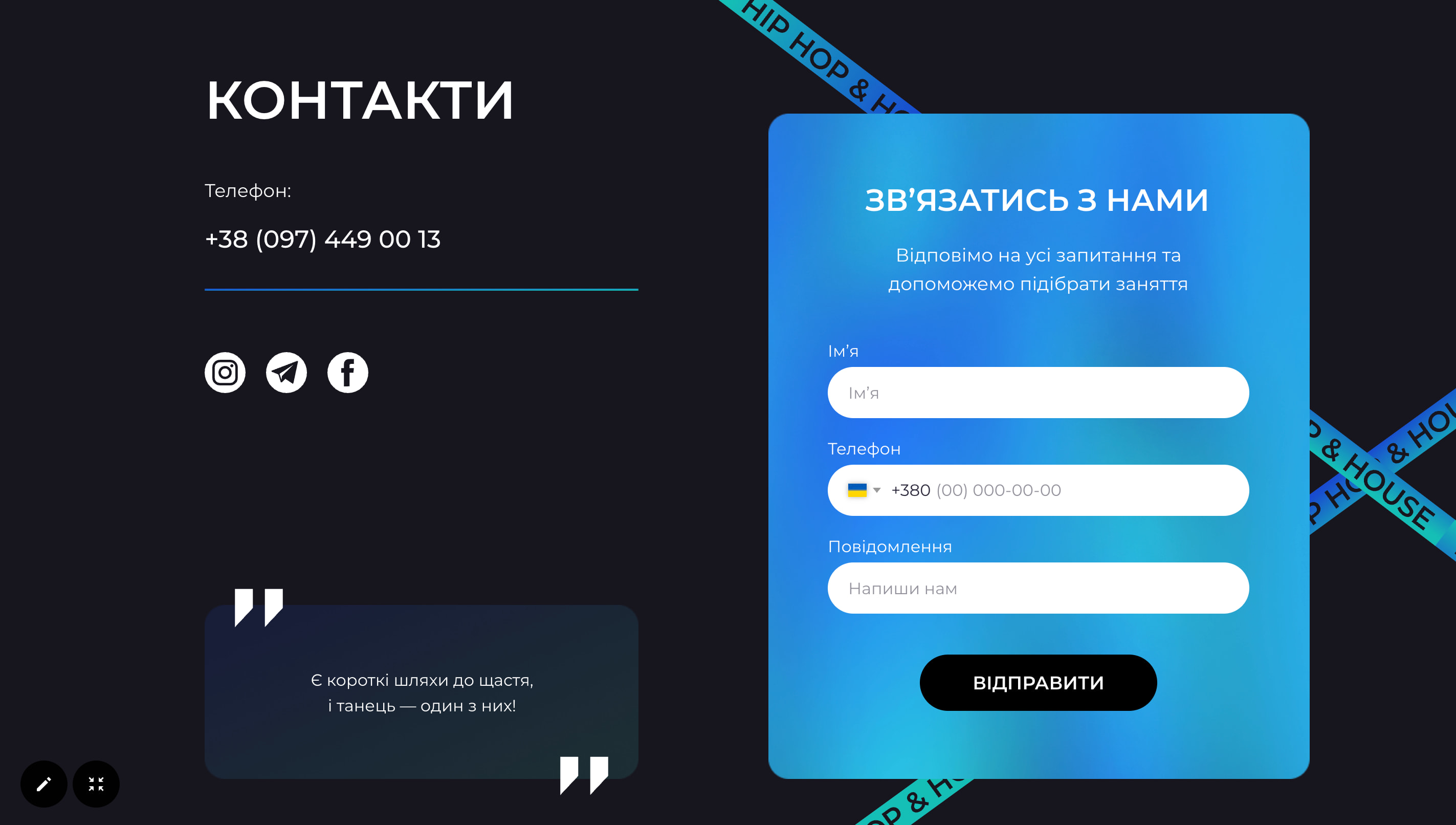
- Contact + signup form
- Map with address
The six pages broke down into two clear groups. Informational pages served prospective students: home, schedules and prices, gallery, news. Transactional pages served the existing community: the merch shop and contacts. The navigation was structured to reflect this split without labelling it explicitly, and visitors naturally gravitated toward whichever path matched their intent.
Prospective students
- Home: overview and CTAs to both paths
- Schedules and prices: class times, levels, costs upfront
- Gallery: photos and videos of performances and battles
- News: community events and opportunities
Dance community
- Merch shop: branded clothing and accessories for dancers
- Contacts: social links, direct contact, lead capture form
Design decisions
The visual style needed to feel energetic and alive without sacrificing clarity, particularly on the pages where people needed to find and act on practical information.
Large hero imagery to set the tone immediately
The homepage opens with a full-width photo of the school in action. Dance is a visual, physical thing, and visitors should feel the energy before they start reading. This also means the practical content (schedules, shop) arrives with context already established rather than having to work against a blank page.
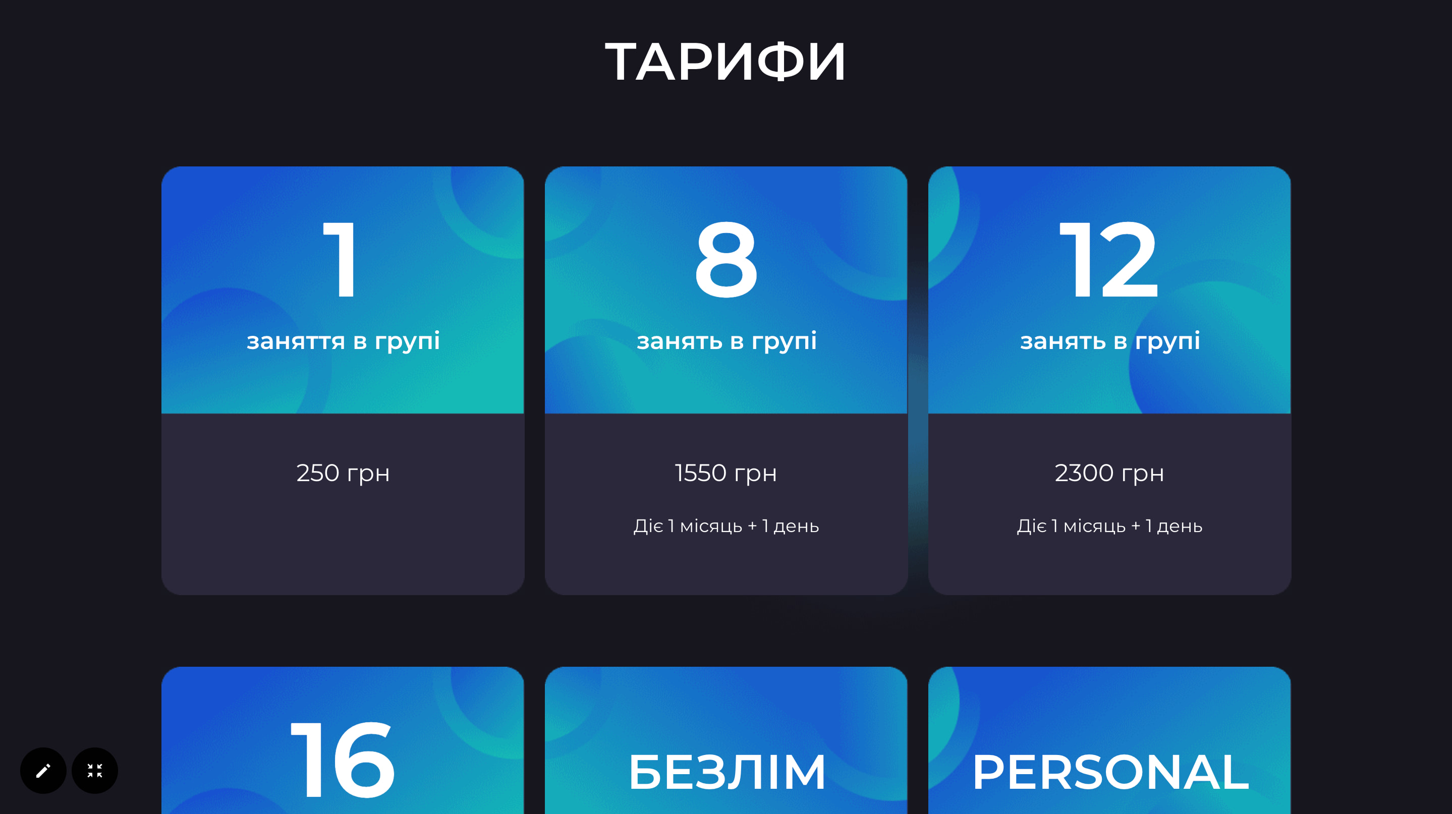
Schedules and prices as a dedicated page, not buried in content
For a dance school, schedule and pricing information is the most asked-for content. Rather than embedding it in a long homepage, it lives on its own page accessible directly from the main navigation. Visitors looking to sign up don't have to scroll through the gallery or past the shop to find what matters most to them.
Teacher profiles as trust anchors
Before committing to a class, people want to know who is teaching. The teacher section puts faces and backgrounds in front of prospective students early, answering the credibility question that most dance school websites leave until too late. Two teachers, two profiles: straightforward and personal.
Merch shop with its own visual lane
The shop section uses product-focused cards consistent with e-commerce conventions: clean background, product image prominent, price and CTA visible. This is a deliberate shift in visual language from the rest of the site, which signals to users that they have moved into a transactional space and can behave accordingly.
Build
Built using Tilda with custom code modifications to extend default functionality. The visual style required several overrides to achieve the dark palette and bold layout decisions that Tilda's standard blocks don't support out of the box. Fully responsive across mobile and desktop.
The teacher section and gallery required custom block configurations: the visual content was the heart of the school's identity, and standard grids didn't do it justice.
Outcome
The site attracted 914 unique visitors over its active period with no paid advertising, with traffic coming from direct (35%), social media (32%) and internal navigation (32%). 13 class signups were recorded at a 1.18% conversion rate. The dual-purpose structure worked: visitors could move between class information and the merch shop without friction, and the signup flow converted a meaningful share of the organic audience the school already had.
What I'd do differently
With more time I'd have run usability tests specifically around the class-to-shop transition: whether users understood they were in a different part of the site, and whether the navigation labels communicated the split clearly enough. I'd also have pushed for a search or filter on the merch page: once the product range grows, a flat grid becomes harder to browse. And I'd have set up Google Analytics event tracking on the class enquiry form from day one to understand which pages were actually driving sign-ups.